
About Bancontact
Everyone knows the Bancontact logo; it's everywhere. That immense recognizability and its extremely functional application are essential for the brand. How do you refresh a logo that has the power of an icon but also needs an update? By opting for a gentle transition.
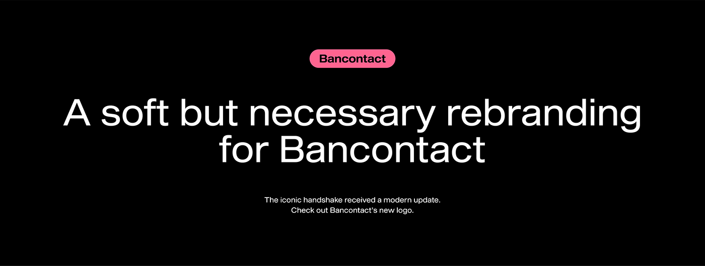
The old logo of Bancontact depicts two shaking hands. A symbolism that no longer fits with the cashless and contactless payments that the brand facilitates. Therefore, we replaced the hands with two new flowing shapes. The departure from the old logo is striking but not abrupt. The strong visual identity that Bancontact derives from its logo is preserved.
For the same reason, we are retaining the brand colors, albeit after a robust upgrade with a stylish, darker shade of the known blue and yellow. In addition, a gradient adds more dynamism and radiance, without affecting the rational relationship that users have with Bancontact. The classy, flowing lines symbolize the effortless and smooth payment solutions that Bancontact offers.
Precisely because recognizability and functionality are so important in this subtle rebranding, we also presented the new logo to a test audience. From some participants, we received the ultimate confirmation: 'What did the old logo look like again?'


